Saturday, September 11, 2010

Book Cover Design

Just finished my latest homework for my Publication Design class, and thought I'd share it with you all on the blogosphere. The assignment was simple; choose any existing book and redesign the cover. This one was fun--and pretty fast & easy, too!

I chose the book Red Harvest, by the great Dashiell Hammett. It's probably my favorite of his novels and if you are not familiar with it, and you claim to be a fan of hard boiled crime fiction, I suggest you buy a copy NOW! (shame on you!) This book was first published in 1929, and has had many printings with different looks. Including these:


For my version, I wanted something modern looking, but still "pulpy." Here's what I came up with...


What do you think? I kinda like it!

Friday, September 10, 2010

Speaking of Polio...

Okay, you got me. I wasn’t speaking about polio. Not too many people I know speak or even think about polio these days. The reason is obvious; the crippling (and deadly) disease has been largely eradicated from our planet.

Older generations remember all too well the common sight of the polio stricken; walking with crutches, wearing those clunky exoskeletal braces on their legs, and the horror of those forced to live within the tomb of an iron lung. Less than 60 years ago, 59,000 Americans alone were crippled or killed by a polio epidemic. Thanks to the vaccines developed by Jonas Salk and Albert Sabin during the 1950s, we’ve been blessed with a nearly polio free existence since.

However, there are a few places left in the world that still struggle with the virus, and the people of Rotary International are among the few who continue to talk about polio, spreading awareness and actively raising money to finally destroy the disease completely. Their effort is straightforwardly called End Polio Now.


As some of you know, in late 2008, Rotary International contracted me to draw the first in a series of educational comic book stories. “Amazing Stories of Polio” depicts the history of the poliovirus and the fight to eliminate it. The story appeared first within the pages of the February ’09 issue of the Rotarian magazine, and soon after was printed as a stand-alone comic that has been widely distributed, and admired by Rotary Club members worldwide.

One such person is Steve Root of Canterbury, UK. Steve is a member of the Rotary Club of Canterbury Sunrise , a group of about 30 men and women of different backgrounds sharing a strong community spirit. A year ago, Steve contacted me with an interesting idea. He wanted to take my comic book pages, enlarge them, and display them in a storefront’s window in Canterbury. His idea was to draw attention to Rotary’s End Polio Now program and share the story with as many passers-by as possible.

I forwarded his request to my Rotarian contacts (who commissioned me) and after many months of discussions, and more time finding an appropriate venue, Steve has finally made his idea into a reality...


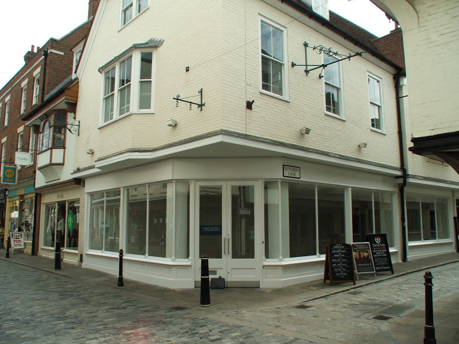
Here on the corner of Butchery Lane and Burgate, a busy UK high street and tourist destination (right by Canterbury Cathedral), the Rotarians have conspired to transform this storefront into one giant comic book...

Steve Root and his amazing giant comic book!

Putting up the second panel

Steve Root and fellow club member, Jim Gascoyne

Ta daaaa...!

Why did Steve Root spend a year on this project? In his own words...

“Polio has been eradicated from the UK for a long time. Many people now don't know the effect polio has on a person, having never seen it for themselves. I'm one of those people. I'm in my early thirties and, until reading your comic, I really didn't have the first clue about what the disease does. I have vague recollections of a sugar cube vaccination in primary school, but no first hand knowledge. Using the comic as a piece of artwork educates passers-by who stop to read it.”

In addition, the campaign will increase local awareness about Rotary in general, and their local club in particular. They also plan to try to raise some money by selling the comics in an adjacent shop and collecting donations.

How long will this display be up? “Until the next tenant arrives. That could be
tomorrow, or a couple of months, we don't know for certain.”


From my point of view, one thing is certain: this is extremely cool! It’s like having my own gallery opening in the UK! “Amazing Stories of Polio,” was a very gratifying story to work on as an illustrator. It’s not often that I get to work on projects connected to a really good cause, and I am very pleased to see my work appearing again and again in different creative ways. (Thanks, Steve!)

P.S. If you happen to be in Canterbury, Kent and see this thing in person, drop me a note here--and send me a photo of yourself, if at all possible! Wish I could be there myself!

Thursday, September 02, 2010

Expanding Horizons

Back in May, I mentioned that I'm currently attending a program at UCLA Extension (for a certificate in Advanced Print and Graphic Communication). It's been great to stretch the old creative muscles, reacquainting myself with design principals I've forgotten, and learning many new tricks, as well as the latest trends & technologies. It has been especially fun to work outside my comfort zone, applying my art & design skills to areas that I have little or no practical experience in--this was certainly the case in the Spring semester, with my Production Design for Film & TV course.

In that class, I had to design fake websites, stage settings, show logos, title sequences and even fake products and advertisements. The instructor, Geoffrey Mandel has an impressive resume of movies and shows to his credit, including his current enviable position in the Art Department of Mad Men (love that show). Before taking his class, I had no concept of what, exactly, a "Hollywood" Graphic Designer's job entails. I must admit that I was quickly taken with the idea! His job looks pretty damned fun--especially on a show like Mad Men.

For that class, we had many interesting homework assignments. I've posted some already, but here are a couple other pieces. First, is a fake, 1960's style magazine ad...


It's okay, I guess. The shampoo looks a bit like dish soap, in retrospect. Below is a another 1960's influenced design for a floor polish bottle...


That was fun. Perhaps even more fun than creating these designs was doing the research beforehand.

While I was taking this class, by coincidence, I had the opportunity to actually do some freelance design work for a TV show in development. This is the show logo for a cooking show that will hopefully be coming to a major network soon...


It's funny. At the same time I was working on this Pizza Quest logo, I also had two other completely separate "pizza" related freelance projects come my way. I've never worked in the pizza business before, so I have no idea why they all came to me at the same time.

Anyway, that was a great class. Interacting with so many talented creative people was so stimulating that I find myself really wanting to get back into that kind of work environment. Freelancing has many wonderful benefits, but I think I'm ready for a day job!

Meanwhile, this summer I've been taking a class in Publication Design. Unlike the last class, here I'm in familiar territory. My whole career has been involved in publishing, starting on staff in the editorial & production offices at Marvel Comics in New York. There I was lucky enough to work in their Epic Comics division, where we had to package a huge variety of books & periodicals in all sorts of formats. Years later, I took those skills, as well as all I'd learned as a freelancer and as the head of a couple digital art studios, to publish my own magazine. Comiculture magazine was such a small operation that I had my hands in everything; including much of the graphic design.

I may not be learning a vast ammount of new information about publishing in this current class, but I have been challenged to apply my knowledge to create designs outside of my usual area; comics & graphic novels. So far, my assignments have included more "respectable" work, like magazine & brochure designs. I'll share a bit here, though I consider these a bit rough. Think of them more as "sketches" than finished work. or, as "works in progress..."

First (and this is really rough!) is a concept for a magazine spread, based solely one the word "paranoia." My idea is that this is an article about terrorists living among us, as represented by the Red Man. He'd appear throughout the article, if it were for real...


Next, I had to grab a bunch of images & text and create book or magazine designs with them. The timing of this coincided with my family vacation to Bonaire, so I used that as an inspiration. Most of the photos are were taken by my wife, my In-laws, or me. This was a fun and meaningful assignment because I got to relive my trip while doing my homework! Here are a couple of the spreads...


Below was another fast & dirty assignment. The instructor provided a bunch of random images, words & phrases. The task was to design a magazine spread using one of the pieces of text as a headline, and whatever art worked thematically with it. The results from the class at large were pretty varied. For mine, I took the phrase "Sky High" and the picture of a ballerina on a blank background, and took off from there. So to speak...


That was a quickie, but I'm pretty pleased with the it, though it could use some finessing.

My latest assignment was difficult. I had to take the content from my "Bonaire" project, and re-purpose it into three tri-fold brochures. The limitations were 2-color printing only, and no more than 3 font families. Here's what I came up with. Still waiting on feedback from the teacher & class, but I know this needs work!


Being in the classroom has been a blast. So much so, that I've signed up for TWO classes in the fall. In a couple of weeks I'll be starting courses in Advertising Design and Advanced Typography. I'm really looking forward to them both. I'll let you know how they go. Thanks for reading! Feel free to comment on any of this. Especially if you want to offer any constructive criticism--the whole point of my taking these classes is to improve myself, after all!

Tuesday, July 20, 2010

The Con Game

Hey all you wonderful people! It's that time of year again, and my love/hate relationship with the San Diego Comic-Con continues! Actually, there's no "hate," per se. Just mixed feelings; I've attended Comic-Con so many times, I often wonder what the point is. My problem is that if I don't go, I always feel like I'm missing something! It's a genuine dilemma! Personally, I find that the 'Con is best when I have a clear agenda; like a new book to promote.

This year, my appearance will be brief. I'm heading down tomorrow, so I'll be there all day Wednesday (for "Preview Night") and about half of Thursday. I have no exciting new projects to promote, nor do I have an Artist's Alley table this year. Therefore, I won't be hanging around any one particular place--so don't look for me! I'm mainly going to look around, see some old friends, and scout out any possible opportunities for work.

Sadly, such a brief trip means I won't see some fellow creators who won't be down until the weekend. I'll also miss some of the fun, like my friend Joanne's party which is tonight, and Thursday night's Drink & Draw party. Still, I'm looking forward to seeing as many friends & colleagues as I can, in the time I have.

Maybe next year I'll be ready for the full week of madness again! See you there!!!
:)

Wednesday, June 30, 2010

More Coloring...

Hello there. Is it summer already??? I've been pretty busy the past few weeks, but things are settling down now. Here's a peek at some comic book stuff I've been coloring...

From X-Men Origins: Deadpool #1, art by Leo fernandez

From Valentine: Plan B for Blonde, line art by Dan Cooney.

These 2 jobs were kind of fun because I got to play around with the color styles a bit. The Deadpool story is very moody and cinematic, jumping around between a lot of different locations and scenarios. I really pushed myself to come up with different & interesting color schemes for each scene jump to help tell the story. For the Valentine story, Dan wanted a simple rendering style on the figures, with more painterly backgrounds. I used Luc Jacamon's excellent work on The Killer as an inspiration.

Today, I'm finishing up some commercial storyboard work. Here's a simple frame...


The line art is by my pal, Don Hudson. This commercial is supposed to emulate a music video or something.

That's all for now! And hey--who's going to Comic-Con???

Sunday, June 13, 2010

Author Fair Aftermath

Last week's 10th Annual Author Fair in El Segundo went well. Don Hudson and I improvised a demonstration on drawing comics that was pretty amusing. It evolved into a format where I took general questions from the audience, while Don drew requests on a large sketch pad. Ultimately, we came up with an impromptu 6-panel comic story about a polar bear.

photo by Shawna James

Afterwards we separated, Don remaining in the Children's section of the library, so he could talk about his work on the Warriors series with the kids. My printed work was deemed more "mature," so they sat me upstairs in the main library, along with my pal Tricia Riley Hale, author of Grand Theft Galaxy. We spent a pleasant hour or so, chatting with library patrons, and all went out for beer afterwards.

Good times. Thanks to all of you who came by to see us!

Friday, June 04, 2010

Author Fair This Weekend

If you're in West LA this Sunday, June 6th, drop by the El Segundo Public Library, and say hello! I'll be participating in their 10th Annual El Segundo Author Fair. The event goes from 12:45 PM to 4:30 PM and includes appearances by about 35 authors who will be signing their books. There will also be discussion panels, poetry readings, children’s activities, and music.

I will be doing a “Comic Book Artist Demonstration” from 1:30 to 2:00, along with my good pal Don Hudson, artist of TOKYOPOP'S Warriors mangas, Gunpowder Girl and the Outlaw Squaw and Forever Amber. I'm not exactly sure what we'll be demonstrating, but I know it will be great! After that, I'll be doing a book signing from 2:15 PM to 3:25 PM. You can also meet the lovely & talented Tricia Riley Hale, writer of TOKYOPOP's Grand Theft Galaxy!

You know you want to!

El Segundo Public Library
111 W. Mariposa Avenue
El Segundo, CA 90245


View Larger Map

See you there! (I'll be there from 1:30-3:30)

Monday, May 24, 2010

Fake Website

This week's homework assignment for my class in Graphic Design for Film & TV was to design a fake website. Something that would appear in a film or TV show on a background computer monitor, or one that an actor might interact with. I decided to do the homepage of a corporate website. The corporation in question? Omni Consumer Products from the movie Robocop...


The large image is actually a slideshow of different OCP projects, like "Delta City," and "Ed-209." Another fun assignment. Now, back to my "real" work...

Friday, May 21, 2010

Thursday, May 20, 2010

Class

In my last post, I mentioned that I'm currently taking a class at UCLA Extension, as part of a certificate program in Advanced Print and Graphic Communication. This semester, the class I'm taking is Graphic Design for Film & Television, taught by Geoffrey Mandel who is the designer on popular shows like Mad Men and Parks and Recreation, as well as films like Surrogates, MI3, Solaris, and Spider-Man 2. He also worked on several of the Star Trek shows & movies, so he has plenty of credits that are impressive to a comic book guy like myself.

The job description of Graphic Designer on a film or TV show is pretty interesting — and one I've never given any thought to before. Basically, he works with the Art Department to create anything that needs graphic design. That could be a show logo, title sequence, set dressings, signage or props. It also includes images that might be played back on a TV or computer monitor within a scene (such as all the monitors on a starship, or a TV news report that a character might be watching, or a website he might be browsing). On show such as Mad Men it is a crucial role, since it is a period drama, where everything must be recreated.

The homework assignments have been fun and varied. One of the tools we've used is the free 3D software application, Google SketchUp. It's fun, free and easy to learn. I'm usually baffled by 3D programs, so I was happy to find that all the demos on their website are easy to follow. For my first try at SketchUp, our assignment was to recreate an existing set from a TV show or movie. I picked the warehouse from Reservoir Dogs.


Here are some screen shots of my model...


Structurally, this building is completely unsound! I was learning on the fly here, so as I built this scene, I became aware of many mistakes that I could easily avoid if I were to build it again from scratch.


In case you're wondering, I did NOT build the car, or the crates, or the table, props and figures. These items were imported into the scene from the handy Google 3D Warehouse. It's full of objects that other people have designed and shared to the SketchUp community. It's one of the things that makes SketchUp fun to work with.


That was fun, but thanks to the learning curve it took forever! In the end, it is nowhere near complete, but I learned a lot about SketchUp.

My second crack at SketchUP was more successful. For this assignment, I had to design the "look" of a fictitious daytime TV interview show called "Barbara." My attempt included a model of the actual set, with logo graphics, as well as an example of on-screen text that might appear. This was also fun...


Above is the backdrop, below you can see the beach scene placed on a curved background on my set. The "Barbara" logo floats in front...


Before modeling the scene, I sketched out a few ideas, including the overused city view that you'd see on Letterman or Leno. I was waiting on the checkout line at the grocery store, when I became inspired by a magazine cover showing an inviting veranda scene...


I liked the columns, shuttered doors and tropical motif, so I kept that in mind while building the set...


Finally, I imported some of these views in to Photoshop and added some figures and graphics (apologies to Barbara Walters & Michael Ironside!)


I have a few more images with graphics that I submitted, but you get the drift. We've also done some other excellent projects in this class, but I promised not to show them at this time. The bottom line is that I'm having a great time. Time spent in the classroom and working on these assignments has been very stimulating and inspirational.

More on what I've been up to lately soon...

Tuesday, May 18, 2010

Life

Hey Blogosphere.

I haven't posted recently, except for the random image, and that's mostly because I haven't been feeling very talkative lately. Or "blogative." Whatever you want to call it. The fact is, so far, it has been a lousy year for me.

Unlike many bloggers, I usually don't like to get too personal in this forum. I'm mostly a private guy, but I use my blog to share images and anecdotes about the projects I'm working on, as well as general observations about the comics biz. Today, I'm going to bend that rule a little, while I share this little piece of Photoshop art with you all...


This is a drawing of my father, James Buccellato. He passed away a couple of months ago, and that has made for a very difficult year. To put it mildly.

In the weeks since the funeral, I've reflected on everything I know about my father, and on my own relationship with him. In the final analysis, I can't say that we were extremely close, but I did love my father very much. This piece of art was an interesting challenge for me. It's really the first time I've used Photoshop in this manner; creating a digital painting from scratch. I didn't use any Photoshop trickery (it isn't a doctored photo) just drawing on my Wacom tablet, looking at photo reference, and using digital paint (whatever that is!)

I enjoyed the painting process, and I savored the time it took to complete it. It was uninterrupted time spent thinking about my dad. My only regret is that it's just pixels and doesn't truly exist like a "real" painting. I did get it printed onto canvas to see what it looks like, and I like the results, but it isn't the same. Maybe I will use it as a study for an actual oil painting in the future.

Meanwhile, I've been just trying to keep busy. A challenge unto itself. I've spent much of this year investigating job prospects and career moves. I want to change things up—abandon the freelance lifestyle and find a more collaborative environment to work in. I've also started taking courses at UCLA with the goal of getting a certificate in Advanced Graphic Design & Communications. This has been a lot of fun — very stimulating. I will tell you about it and share some of my school work in future posts.

I'm starting to feel as though things are looking up. Lately, I have been busy with work and I have some interesting job prospects. Last week was my birthday. Milestones like birthdays provide a good excuse to reevaluate and rededicate oneself. I'm staying positive and moving forward! Keep an eye on this blog, my friends, because I'll be posting some interesting news and cool artwork soon!

Thanks for reading. This was a difficult post to write, but I wanted to share the picture of my dad, and that necessitated an explanation of sorts. Next time, I'll be all business. ;)

—S

Friday, March 12, 2010

Hippo-Man in a Tank


A page from an upcoming issue of Elephantmen from Image Comics!

Friday, February 12, 2010

Kid Art


One in a series of drawings I'm currently working on; fun character sketches of kids. There are a few more that I can post later.
Enjoy!

Saturday, January 30, 2010

Storyboard Job from '08

Below are some drawings from a job I drew in late 2008. The client was an Entertainment entrepreneur from Kuwait who was involved in producing all kinds of media. This particular project was for a proposed animated music video. The story line follows two characters called Tarek & Elaine who meet in the ocean and fall in love while flying around the heavens and creating a floating island paradise (pre- "Avatar," btw!).

I posted a couple of these images back when I first drew them, but now that the job has long past, I think it's safe to share a bit more, just for fun. In total, I drew about 60 boards. Here, I present a third of them...