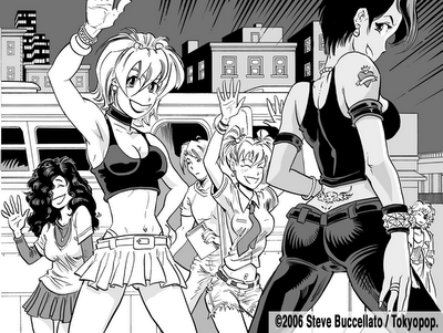
So, hey! Here's a sneak peek into the project I'm now working on! It's a new manga called Battle of the Bands that will be published by Tokyopop next July! On the bar to the right is a link to my special Tokyopop blog. Bookmark it, cuz I will be posting more preview art there in the future!
Enjoy...

3 comments:
Now those are some tighht leather pants!
I have a question. You once told me that, when adding grey tones to a comic, to avoid going much darker than 50% because anything darker prints like mud. Am I just wrong, or are some of your tones here a bit darker than that? Also, in Manga, it seems to be the style to have some pretty broad screen tones, with DPIs (Dots Per Inch) of 8 or less, and lots of pattern screens and other such fireworks. Are you going to be employing these at all in your work on this? Finally, what would you say about jumping to such a culturally distinctive style straight off of something that was perhaps more idiosyncratic as you Reagan work? I've only seen a couple of pages of your Reagan bio, but that certainly didn't appear to have the manga vibe that you have going on here. Well, it's a nifty looking page, I'll hand you that. With tight leather pants. That's always a bonus.
Thanks, Allen!
As for the 50% thing: This is a general guideline, which sometimes even I break. I think the page I posted has the darkest grey being 60 or 65 %
Mostly, this rule should apply to mixing the k-tones with other colors. Typically, a colorist who used, say, a 50% K 60% Cyan may be surprised how dark that color really prints.
Of course, these days, printing is better than it once was, and many publishers use glossy papers which can take the higher ink saturation.
I think its best to be cautious, in any case.
As for the dot-patterns, yes, I am planning to go full-on manga style by converting the pages to bitmap files with a halftone screen to achieve that "zip-a-tone" look.
Finally, it's been interesting jumping around, style-wise. Not easy, but fun. I find that more and more, the better I get at trying to emulate the Japanese manga style, the more I find it is NOT such a stretch from the cartoony style I used in Weasel Guy.
Anyway, you can be the judge on how successful either style really works, once the books are done & printed!
Later!
You rock.
Post a Comment